
Art Direction
Copy Writing
Motion Design
I design dynamic presentations around the audience and the decision or response a brand needs from them. That means helping to shape the story and messaging alongside the visual direction, then strategically using color, bold uses of typography, modular compositions, and engaging motion elements to sustain attention and sharpen the message. From fundraising pitches and board presentations to keynotes, panels, and live events, the goal is the same: make complex ideas feel clear, compelling, and worth acting on.


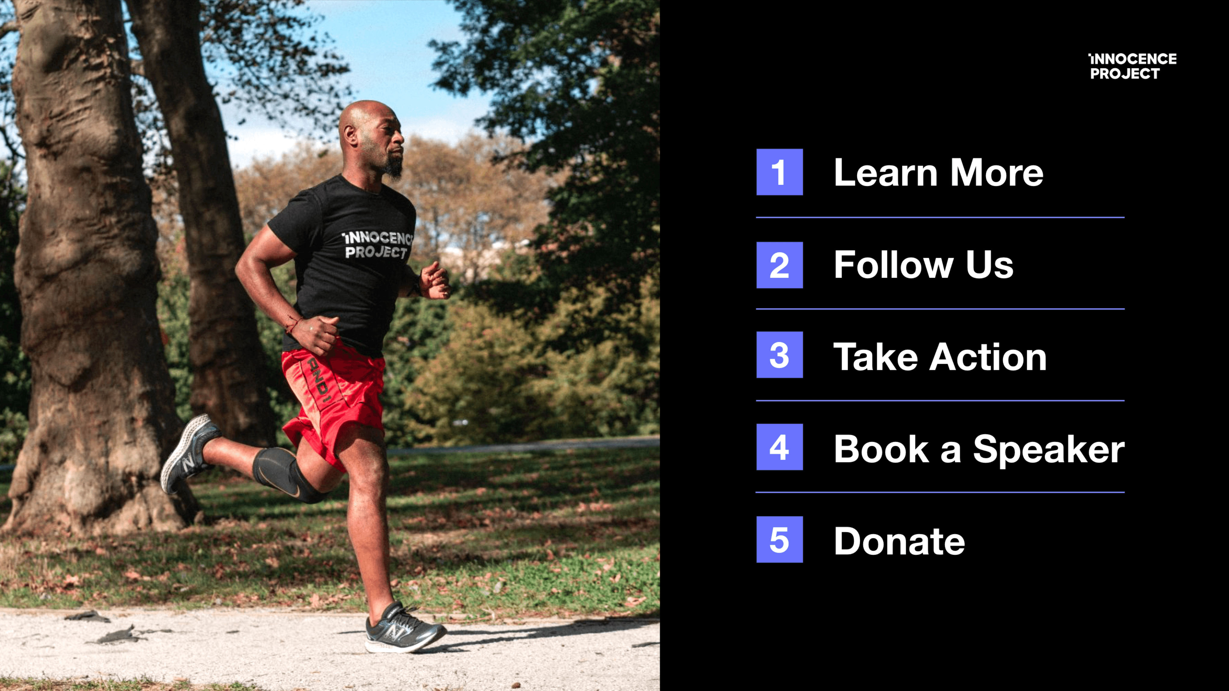


Presentation design had become inconsistent across and within departments as the organization grew in size in recent years, with uneven layouts, lengthy copy, and different font choices making decks feel disconnected from one another and from the brand itself. The lack of strategic design risked weakening its brand equity and the effectiveness of its messaging. I worked to raise the creative bar with bolder typography, more dynamic motion elements, modular layouts, shorter and stronger messaging, testing these strategies with a few pilot decks before building out a comprehensive presentation template system to make that standard repeatable across the departments.
The template includes a mini brand guide, flexible layouts for common presentation needs, and clear guidance for staff and external partners. Because our primary font, Aktiv Grotesk, isn’t available in Google Slides, I established Helvetica as the standard substitute, eliminating one of the biggest sources of visual inconsistency. I also built in a feedback survey so the system can evolve with the teams using it. The response from senior leaders across the organization was immediate: “This is incredible.” “This is amazing.” “This template is beautiful.”

