Francine James Shop Brand Design
A boutique retail brand that celebrates black creatives.
2021 · SUITE 4E HOTELS & RESIDENCES · BRAND DESIGN

Francine James is boutique shopping sub-brand of Suite 4E Hotels & Residences that sells products made by local Black creatives as a way to connect their guests to the local culture and people.
The Scope of Work
As part of my work designing the Suite 4E brand identity, I was hired for this project to develop an umbrella brand system that allows for flexibility in Suite 4E’s brand, and the ability to create micro-brands under its parent brand that are visually connected to it while also distinct. The first of these sub-brands that I was contracted to design was Francine James’, as an example of how Suite 4E’s brand, from its colors and primary font, could adapt in different ways to enable the formation of a new sub-brands.
The store specifically caters to Black and brown women, and so it was important that the brand reflect this in turn. As a result, I designed Francine James’ identity in a way that used Suite 4E’s primary font, while foregoing its deep green primary color in favor of its terracotta secondary color and extending this terracotta scheme to reflects the diverse shades of Black women that Francine James aims to appeal. Though connected to Suite 4E’s parent brand, Francine James’ brand was designed to be distinctly lighter, more feminine, more airy, and yet grounded in earth tones.
My Role
Brand Design
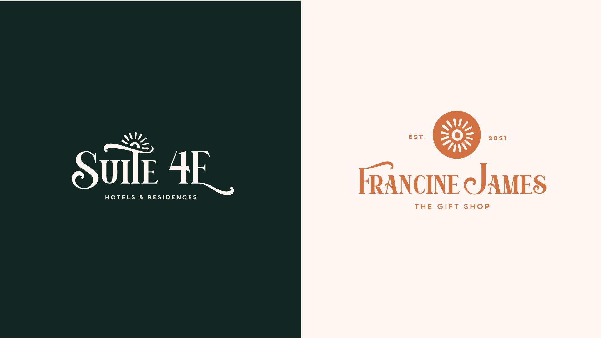
SUITE 4E HOTELS & RESIDENCES’ MOTIF
FRANCINE JAMES | THE GIFT SHOP’S MOTIF
A MICO-BRAND FOR A HOTEL
Whereas Suite 4E’s visual identity heavily uses rich, velvety greens alongside a terracotta color, the client wanted Francine James to adopt a more light visual identity that reflected the sense of femininity that the brand’s name, Francine James, communicated. As a result, Suite 4E’s terracotta color was extended to Francine James’ visual language and made its primary color, distinguishing itself from Suite 4E’s visual language by making far more use of the terracotta color, while still staying within the natural color scheme of the Suite 4E brand family.
To further distinguish Francine James’ brand from Suite 4E, while communicating it as a subbrand of Suite 4E, I adapted Suite 4E’s “African Sun” motif slightly by enclosing it with a terracotta circle — the inverse of Suite 4E’s motif, and yet wholly inspired by it. At once, different and yet the same.
DESIGNING A BRAND FAMILY THAT EVOKES AN UMBRELLA HOSPITALITY EXPERIENCE
ITERATIONS
We landed on concept 3 as a fusion of the previous two concepts. The client and I also thought this concept best balanced with and complemented the wordmark of Suite 4E Hotels & Residences, evoking the same visual characteristics to convey that Francine James is part of Suite 4E’s brand umbrella, yet distinct enough that it can be its own brand while staying within Suite 4E’s design language.


