Taking on Transformation Publication Design
A bold brand & publication for a bold vision of youth justice.
2021 – 2023 · COLUMBIA JUSTICE LAB / CATALYZE JUSTICE · BRAND DESIGN / EDITORIAL DESIGN
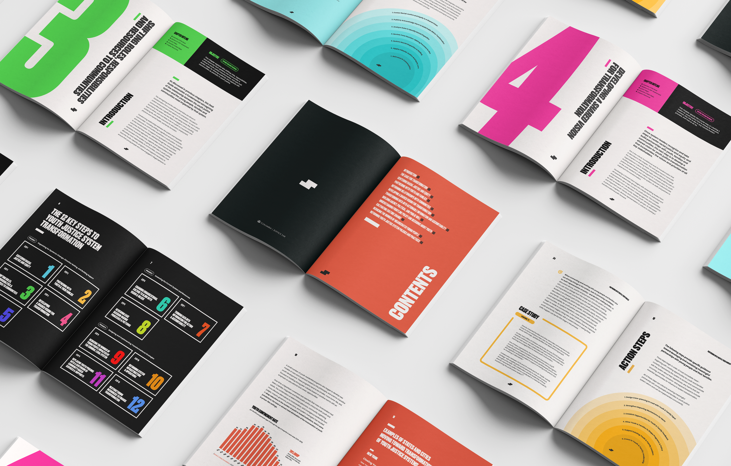
Taking on Transformation is an omnidirectional multimedia project that, in addition to a webinar series and an interactive website, is centered around a comprehensive 500+ publication called “The Desk Guide” that guides leaders looking to push transformation of the youth justice system.
Scope of Work
I was hired by Columbia to build up this ongoing design project and to develop a micro-brand for this project that would be applied to its different multimedia manifestations — an omni-platform brand that transverses across and adapts to different media from a publication to a webinar series to a website. I was hired to develop this project’s visual identity and the editorial design for the project’s flagship publication, referred as the “Desk Guide” — a step-by-step handbook on how to take take this abstract notion of transformation and actually implement it.
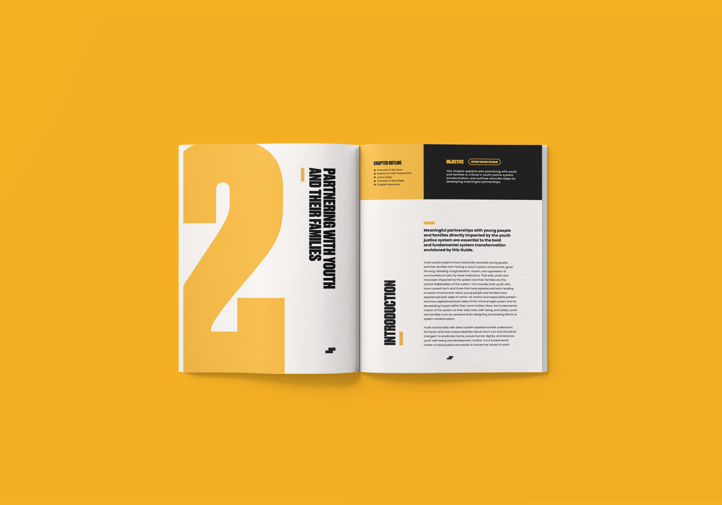
The Guide features twelve chapters, each focusing on a different step in the transformation process, from how to center racial justice and equity to how to shift resources and power to communities. To move away from the typical one and done practice of dropping a publication, promoting it, and then moving on, each step of the guide represented as a chapters, in this publication is published with its own accompanying digital page on the website that brings the chapter to life through interactive features.
My Role
Brand Strategy & Design
Multimedia Production
Editorial Design
Copy Strategy
Project Management
Alexander Schneider, Senior Project Manager,
Columbia Justice Lab

VISUALIZING TRANSFORMATION
DESIGNING THE BRAND IDENTITY
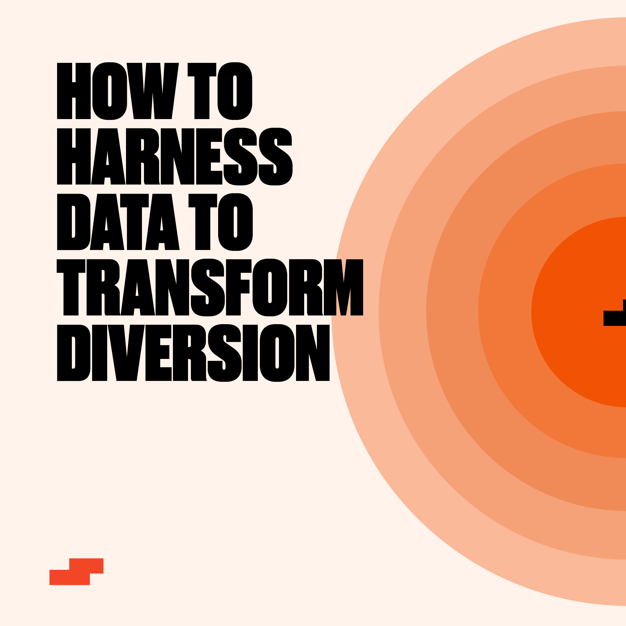
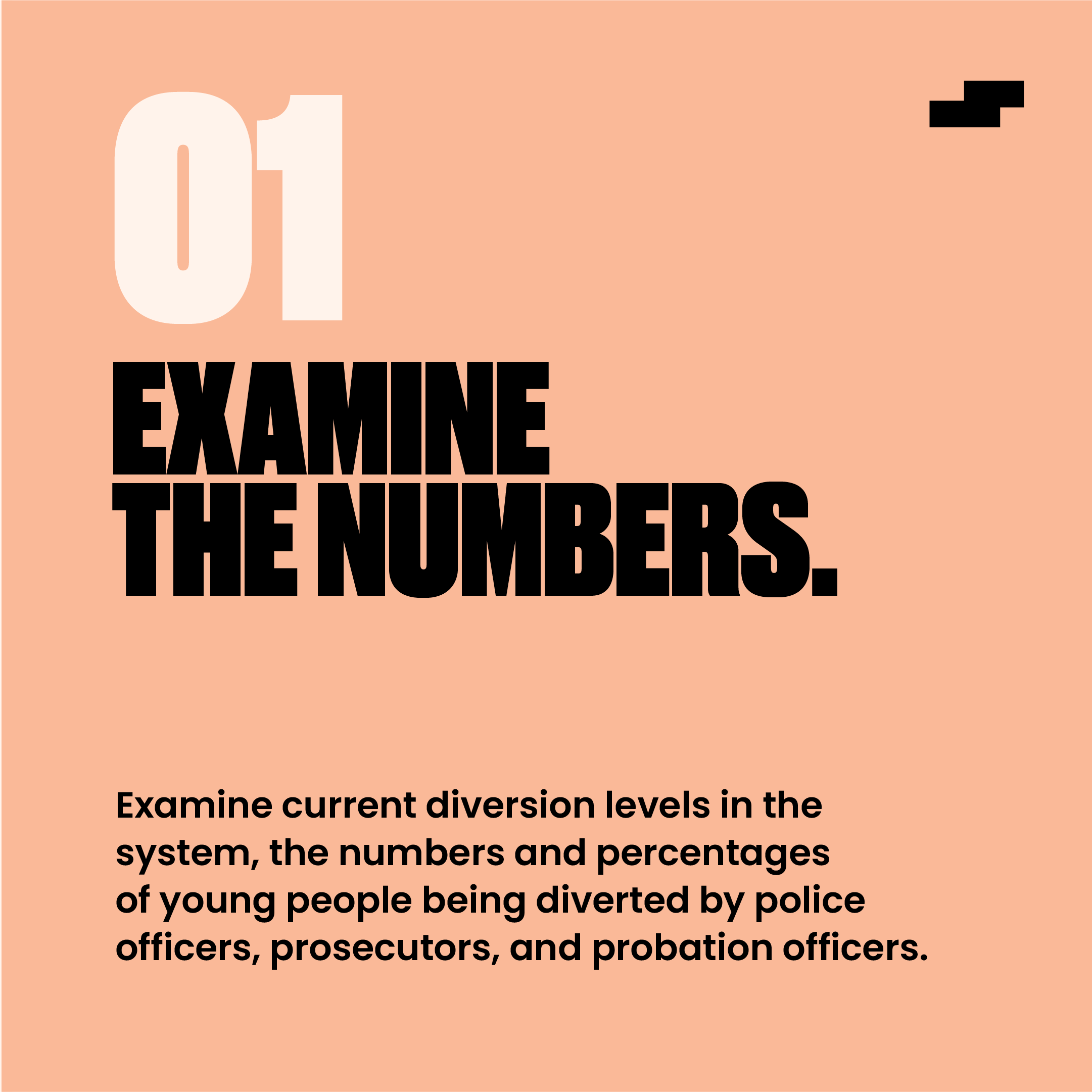
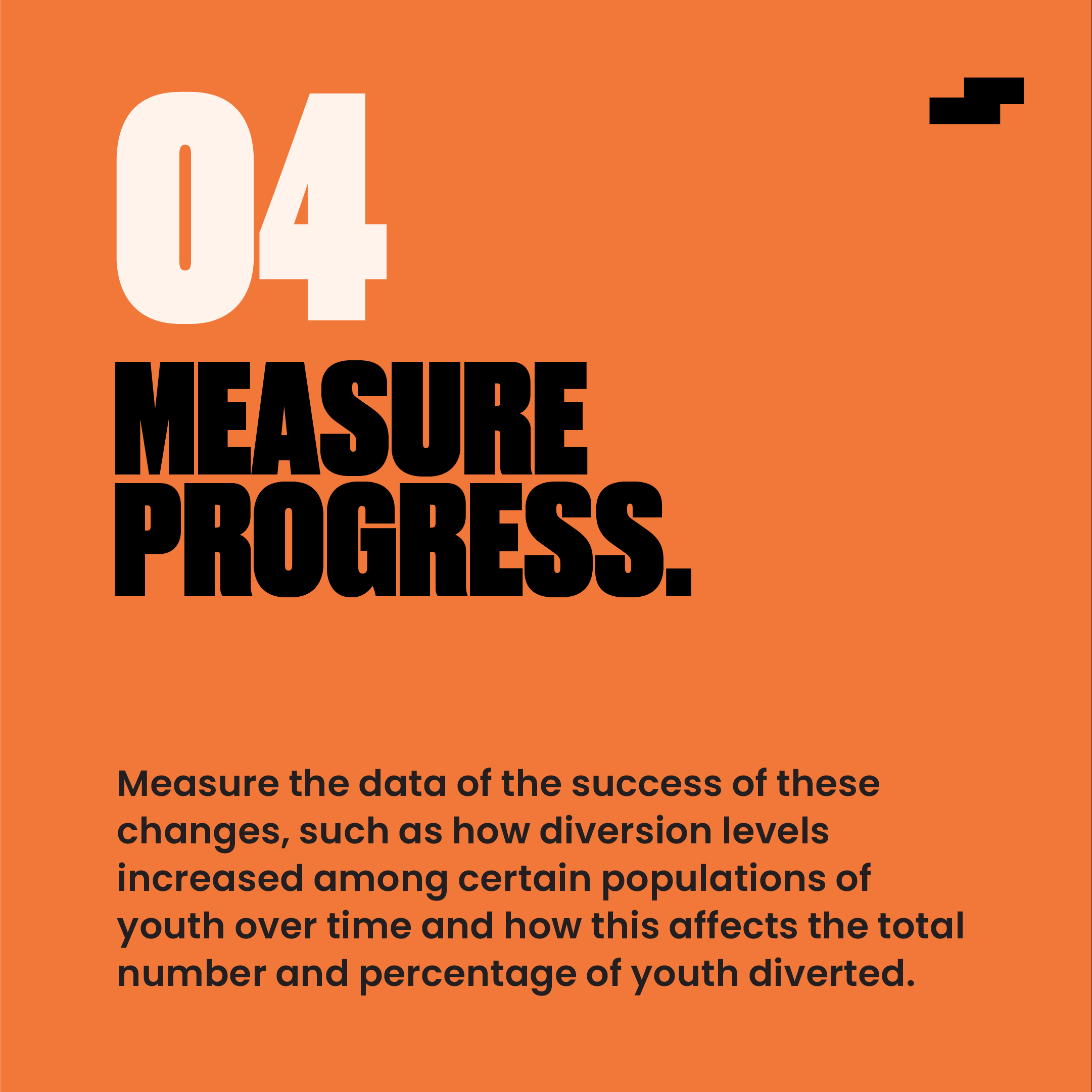
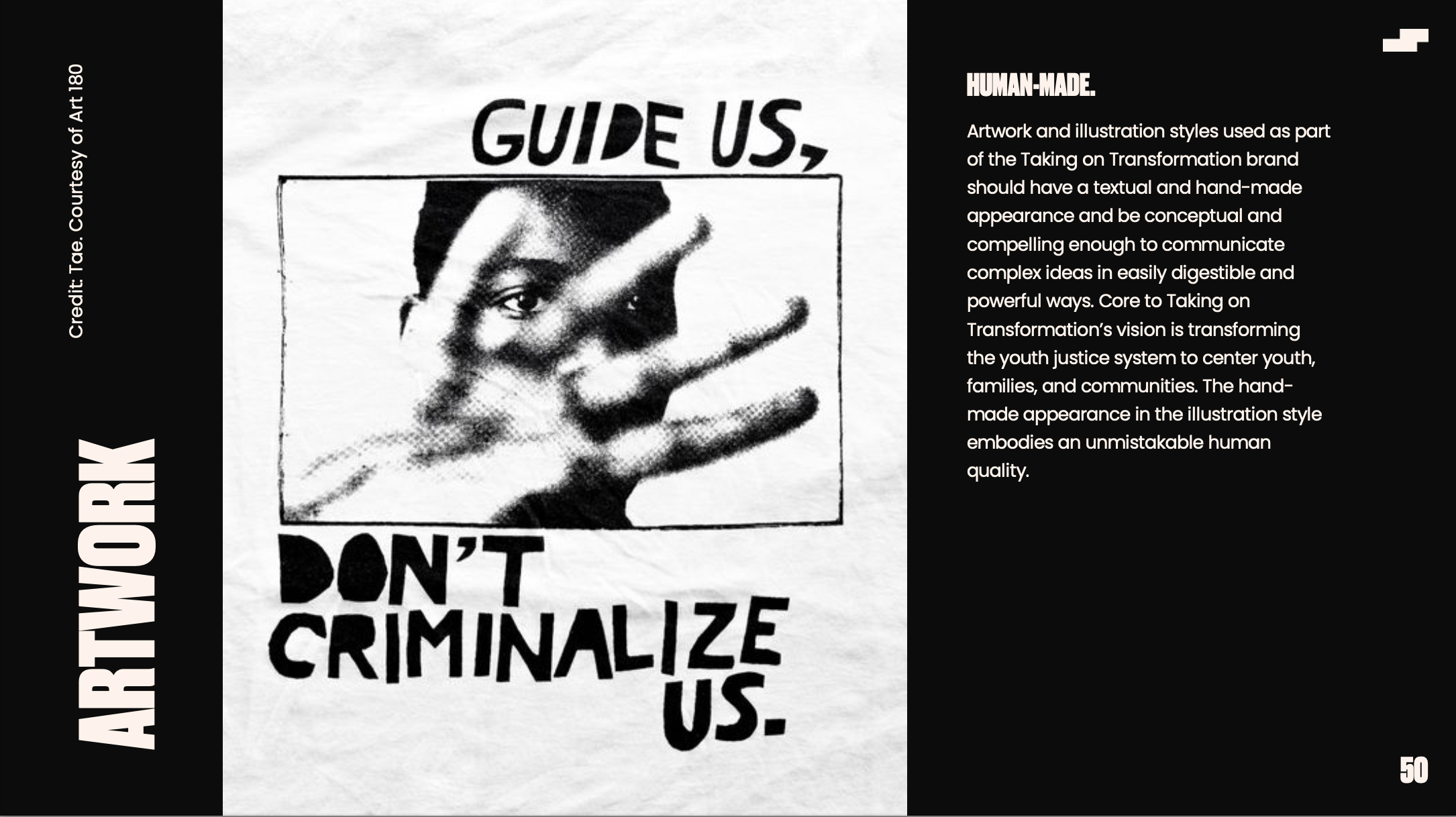
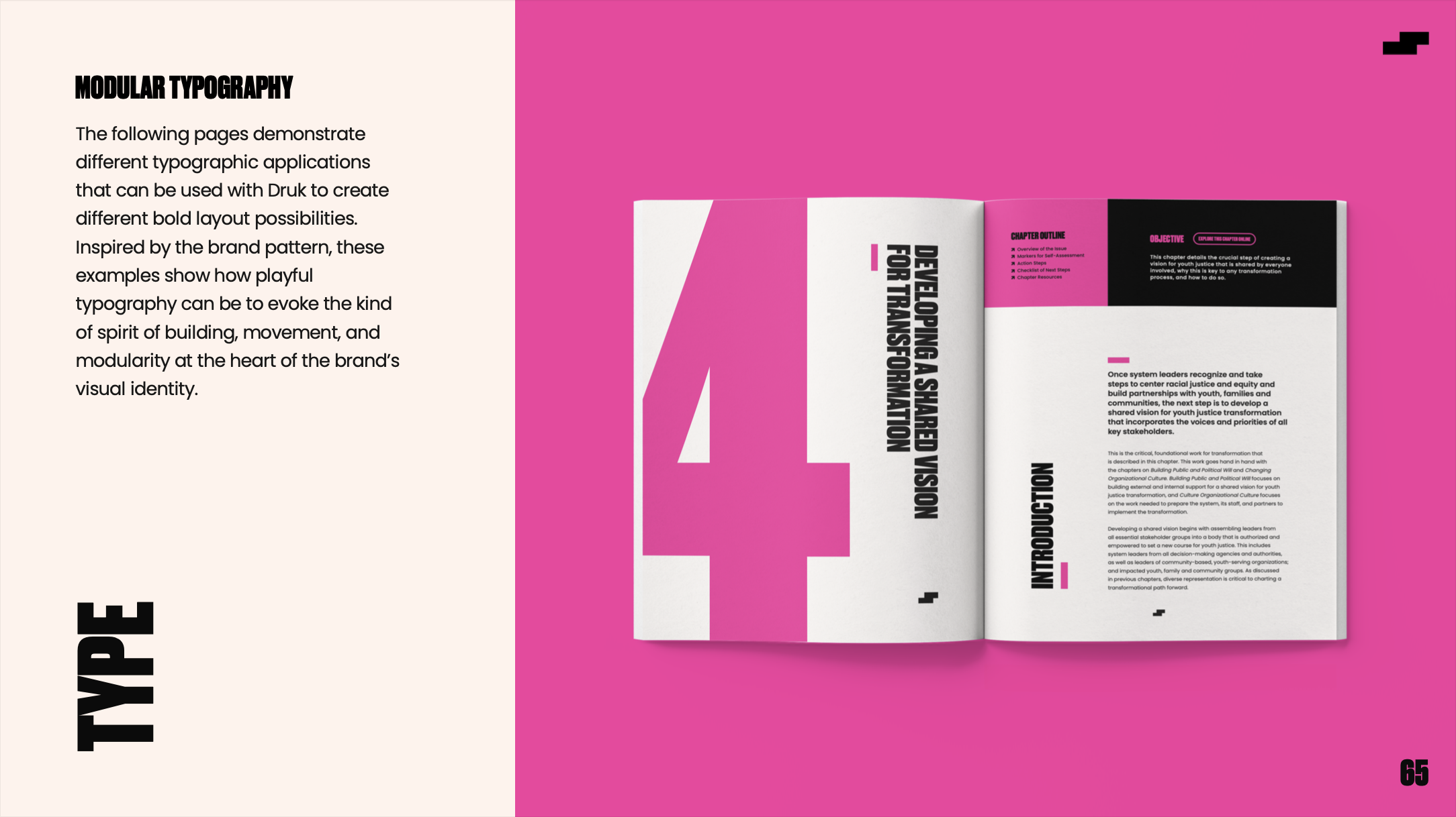
Though Taking on Transformation primarily speaks to system leaders, the design, from the font selection to the color scheme, is intentionally aligned with the communities and the youth impacted by the system, signaling to leaders that they should be aligned with them too. It’s bold, it’s colorful, it was designed as a challenge and rebuke to the usual institutional designs of textually-heavy white and black government memos and academic reports. After a series of discovery conversations around the team’s vision for the project, the design language of the visual identity and editorial design — which is extended to the website and webinars — was developed to be intentionally anti-institutional, reflecting a shift from institutional model of justice to one centered on community supports through, for instance, bold typography and a youthful color scheme.
The logo and icon represents forward movement, almost like stepping stones, but also tetris-like blocks, puzzle pieces, that move and rearrange themselves, like gears finding their places, moving in unison, clicking into place with one another to symbolize the different movements of different stakeholder groups, community groups, advocates, system leaders, policy makers, directly impacted people, youth, and so on coming together in partnership to take on the task of transforming the youth justice system.
PREVIEWS
THE BRAND GUIDE
THE DESK GUIDE
SOCIAL MEDIA DESIGN


